The Disappearing Billboard: Designing Facebook Ads That Fade
What if your most eye-catching Facebook ad was the one that slowly vanished? Disappearing creatives flip the scroll script: instead of shouting, they whisper—then fade. The result is urgency, curiosity, and a tiny pang of FOMO. With an AI photo generator to mock up atmospheric textures and Dreamina to refine the effect, you can craft time-sensitive visuals that feel like magic tricks in the feed.
Vanish to be seen
Disappearing ads win attention because they create a mini-deadline in the mind. As elements recede, the message clarifies—then slips away. Viewers lean in, tap, and act before the moment meets the ether.
- The fade is a countdown the audience can feel.
- Negative space becomes a stage for what remains.
- Loss aversion (don’t miss this) works without loud alarms.
The anatomy of a good fade
The most effective vanishing effects use contrast and pacing, not gimmicks. Think "breathing poster" more than "smoke bomb."
- Anchor first: keep one element steady—price tag, date, or CTA—while everything else dissolves.
- Staggered layers: background textures fade first, then secondary copy, then supporting icons.
- Readable at every frame: any paused moment should still make sense.
Type you can hear ticking
Typography can imply time. Your letterforms don’t just sit there; they decay gracefully.
- Start with bold, high-x-height fonts; taper stroke width over a few frames.
- Use soft masks to "erase" counters (the holes in letters) before stems.
- Let tracking widen as the word fades, like sound dissipating in a hall.
Micro-copy that moves the moment
Short lines carry urgency without anxiety:
- "Here now—gone in a blink."
- "Fading price, fading time."
- "Catch the glow before it goes."
Palettes that evaporate
Color can do the vanishing act for you. Build a palette that exits in an elegant order.
- Glow to ghost: neon edge highlights that dim to cool gray.
- Warm to cool: warm hues (action) gently cool (repose) as the offer expires.
- Dual rails: keep CTA buttons on a separate palette rail so they remain legible through all phases.
Motion like a sigh
Looped micro-animations are your best friend. Subtle is sticky; viewers replay without realizing.
- Dust-grain drift that thins each loop.
- Gradient "sunset" that lowers behind the headline.
- Soft blur creep from edges inward, leaving the CTA crisp.
Designing a logo that knows how to leave
When your mark participates in the choreography, branding feels intentional rather than pasted on. This is where Dreamina's AI logo generator can help you rapidly explore "vanishing variants" of your logo—outline-only treatments, subtractive masks, or time-sliced monograms—without redrawing from scratch. Keep one invariant (the dot on the "i," the angle of a glyph) as the identity’s heartbeat while the rest fades.
Interaction without the circus
Disappearing doesn’t mean difficult. Keep the interactive layer simple so the concept shines.
- Tap-to-pause sequences that hold the image at a mid-fade sweet spot.
- "Restore" overlays that briefly bring back full opacity for details, then let go.
- Carousel variants: panel one crisp, panel two half-fade, panel three whisper-thin—each panel adds a puzzle piece.
Copy that breathes in three acts
Your message can echo the fade.
- Act 1 (arrival): a confident headline—"Night sale starts now."
- Act 2 (drift): a second line softens—"Only while the glow lasts."
- Act 3 (echo): a near-invisible tag—"Ends at midnight."
Keep body copy minimal. In vanishing design, silence is a layout tool.
Scale for small screens
Facebook’s mobile feed is unforgiving; design as if you’ll only get a glance.
- Compose for the thumb: center-weighted, no fragile hairlines.
- Treat 1:1 and 4:5 as your main canvases; preview on low-brightness modes.
- Test captures: every 0.5 seconds of your sequence should look like a poster.
Tiny collectibles that keep the message alive
After the main ad fades, leave traces across your ecosystem. Light-touch character stickers or reaction badges can echo the campaign mood in comments and Stories. A sticker maker workflow turns your fading textures into miniature ghosts—think "vanish spark," "dimming star," "last-call bubble"—that fans can drop onto their content. It’s a gentle afterglow that keeps your story circulating.
Budget-smart production kit
- Start with lo-fi animated comps to lock pacing, then upscale assets once timing sings.
- Use masked noise and gradient ramps for elegant fades instead of heavy particle systems.
- Build a style sheet: opacity milestones (100-70-40-10), blur radius, and color exit order.
Now you see it, now you make it (with Dreamina)
Step 1: Write a text description
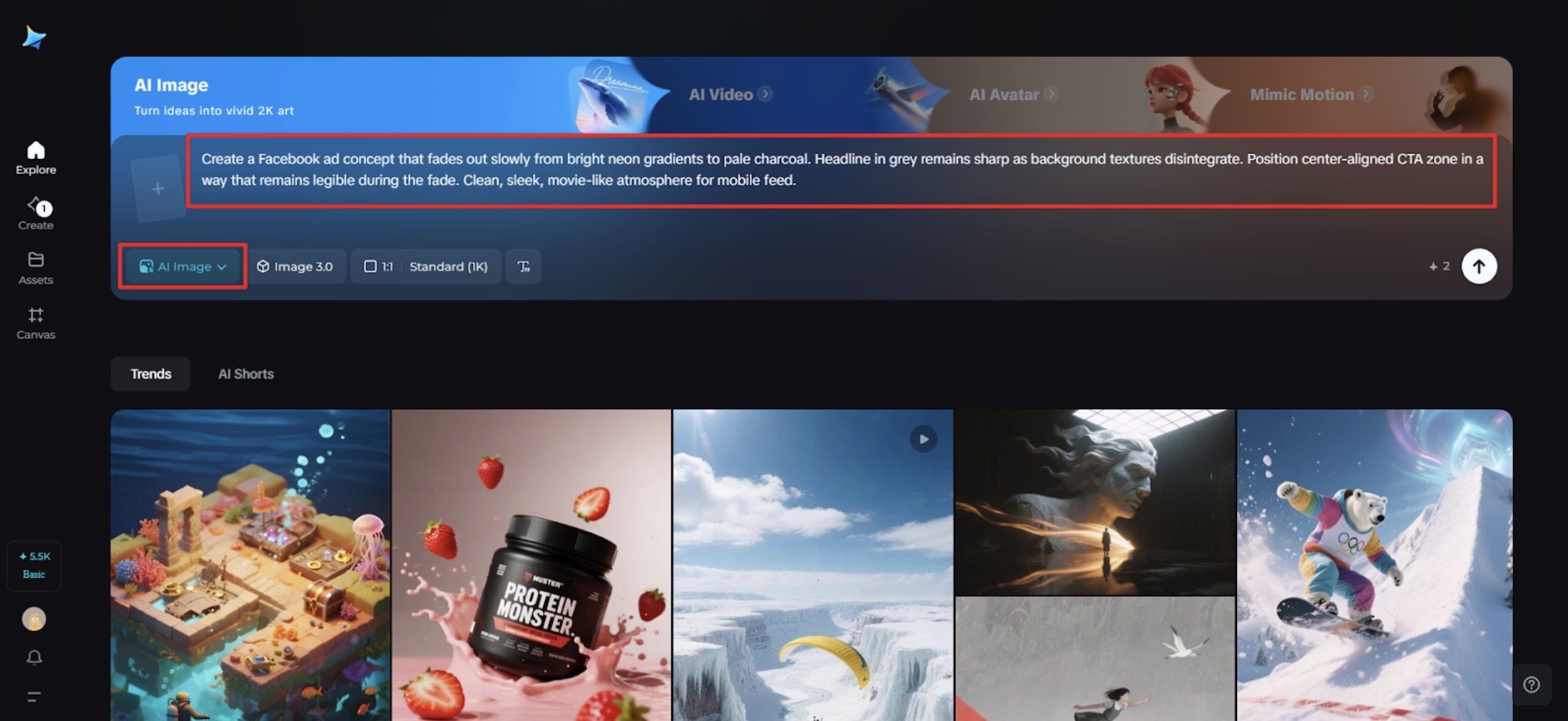
Go to Dreamina and create a full description prompt for your declining aesthetic, sequencing, and brand tone.
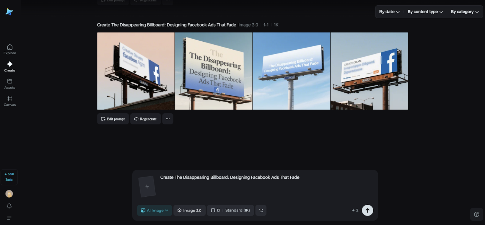
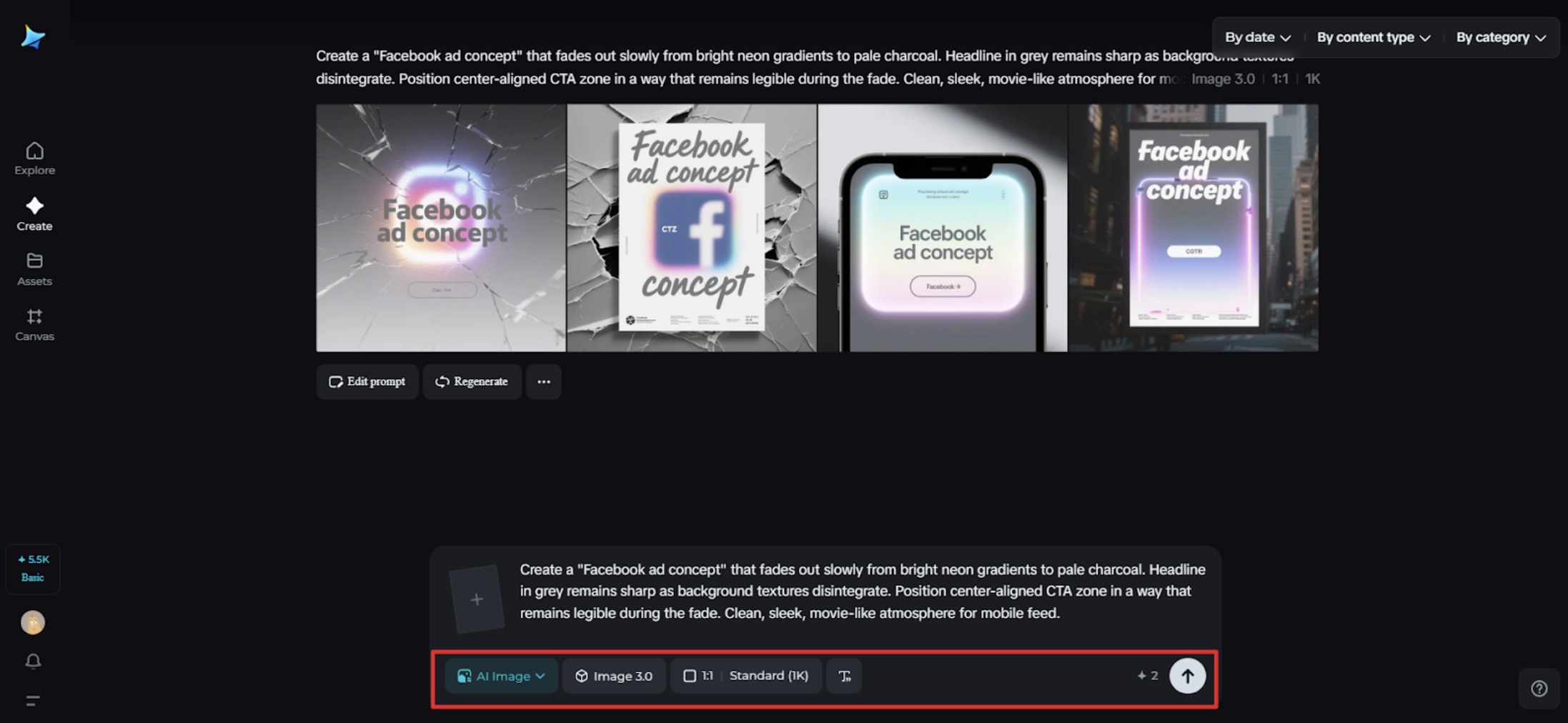
Example prompt: "Create a Facebook ad concept that fades out slowly from bright neon gradients to pale charcoal. Headline in grey remains sharp as background textures disintegrate. Position the center-aligned CTA zone in a way that remains legible during the fade. Clean, sleek, movie-like atmosphere for mobile feed."
Step 2: Adjust parameters and generate
Select the model, input aspect ratio (4:5 and 1:1 for feed), select size, and choose resolution (2k for final and 1k for test). Finally, click Dreamina's icon to create. Repeat until mid-fade frames resemble as much as the initial.
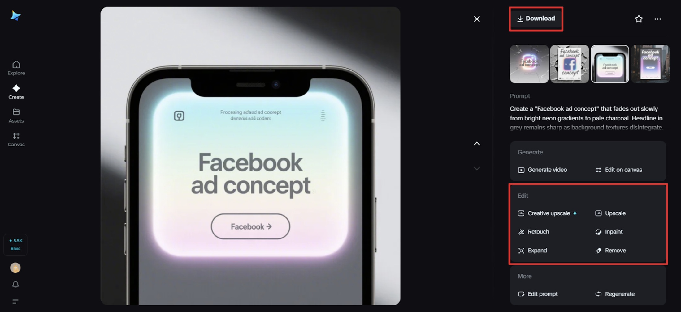
Step 3: Personalize and download
Apply Dreamina's AI customization—inpaint, expand, remove, and retouch—to refine edges, equalize contrast between frames, and normalize typography masks. When the sequence appears to make sense, hit the Download icon to export your assets for animation.
Field notes for a flawless vanish
- Lead with light: highlights fade first; core message lingers.
- Honor the break: not everyone sees the loop; freeze-frame still has to sell.
- Timebox the tease: 3–5 seconds is enough; urgency kills if you stay longer.
- Skim caption: match the animation with a one-line hook that exists independently.
Testing the invisible
Quantify how the fade influences behavior, and not mere vanity metrics.
- Hold rate: do individuals view the loop twice?
- Tap-through: does the vanishing act spur action sooner?
- Comment sentiment: are people saying things like "love the fade!" to describe the effect?
Make A/B sets with static vs. fading images and the same copy. You've figured out your pacing if the vanishing version generates more clicks early in the funnel.
Extending the midnight moment
Turn the concept into a micro-campaign that surfaces across your touchpoints.
- Countdown covers for your Facebook page header that dim hourly.
- Carousel "peels" where each slide reveals less background, more offer.
- Quiet retargeting: a nearly blank image with a faint silhouette—"We thought you might still be looking."
The last glimmer
Disappearing billboards aren’t about hiding; they’re about inviting. By letting your ad exhale—by allowing color, texture, and copy to drift—you build urgency with grace. Mock the mood with an AI photo generator, refine the craft with Dreamina, and let your message land like a passing comet: brief, bright, remembered.
When you’re ready to make the next one, Dreamina will be there—appearing right when you need it, before vanishing into your creative toolkit again.